7 Shopping Habits Retailers Count On You Having
The grocery store you walked into this week was designed by someone with a graduate degree, who based the layout on a half-century of peer-reviewed behavioral research, who knows things about how you make decisions that you don’t know about yourself. The pricing, the music, the smell of the bakery near the entrance, the order of the aisles — none of it is accident. Seven of the most carefully engineered tricks built into retail, each with the original study behind it, walking through the store roughly in the order you’d encounter them.
The disoriented feeling you get a few minutes into a store has a name — and it was named for the architect who later disavowed inventing it
Victor Gruen was the Austrian-American architect who designed Southdale Center, the first enclosed shopping mall in America, in 1956. His vision was civic — a European town square, indoors, a place for community life. What got built instead was a consumption labyrinth designed to break your sense of direction within minutes of entering, at which point you’d stop being a goal-directed shopper (“I need toothpaste”) and start being a browser (“oh, that looks nice”).
That mental shift now goes by the name the Gruen transfer. It’s induced by winding paths, sightline interruptions, varied flooring, lighting transitions, and the first 10-to-15 foot “decompression zone” inside the door where shoppers can’t process merchandise because they’re still acclimating from the parking lot. The decompression zone is why nothing important gets placed near the entrance — your brain isn’t ready to see it yet.
Gruen himself loathed what his idea became. In 1978 he gave a London speech accusing developers of having “bastardised” his work. He died in 1980; the design philosophy that bears his name has continued without him.
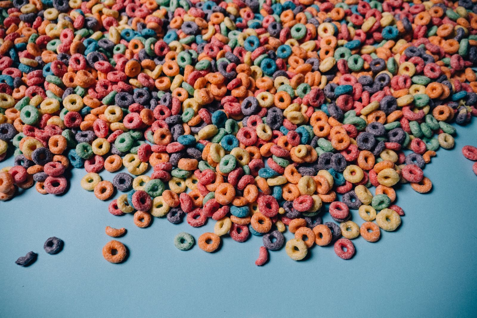
Shelf placement at eye level outsells shelf placement at knee level by huge margins — which is why sugary kids’ cereal is at child eye level, not yours
A 1994 paper in the Journal of Retailing by Xavier Drèze, Stephen Hoch, and Mary Purk ran a series of field experiments on grocery shelves. They tested how much sales were affected by horizontal placement (more facings of the product) versus vertical placement (height on the shelf). The vertical effect was much larger.
Products moved from waist or knee level to eye level saw sales rise by roughly 35%. The horizontal effect — how many facings of the brand are visible — barely moved sales once it cleared a minimum threshold. This is what retail people call shelf elasticity, and it explains a lot of supermarket geography.
The reason sugary cereals are at a strangely low shelf height is that “eye level” for a five-year-old is roughly three to four feet off the ground. The shelves are calibrated to whoever the brand wants to grab. You’re either the target or you’re not.
Slow background music in a supermarket can lift gross sales by nearly 40% — by slowing your walking pace without you noticing
Ronald Milliman ran a nine-week field experiment at a mid-sized supermarket in 1982, alternating between no music, slow-tempo background music (under 72 bpm), and fast-tempo music (over 94 bpm). The slow-tempo weeks produced average daily gross sales of $16,740 versus $12,113 for fast — a 38.2% sales lift.
The mechanism is gait-pacing. Shoppers unconsciously sync their walking speed to the tempo of the music. Slower foot speed means longer dwell time in front of more shelves, which means more items in the cart. In-store music isn’t there to put you in a good mood. It’s there to make you walk slower.
A 1999 follow-up by Adrian North at Leicester tested the same logic at a wine display: French accordion music made French wine outsell German wine five-to-one, then reversed when the music switched to German oompah. Shoppers questioned afterward had no idea the music had influenced them.
Pumping a simple, pleasant smell into a store extends dwell time and lifts evaluations — through a sensory channel that bypasses conscious filtering
Eric Spangenberg’s 1996 Journal of Marketing paper introduced controlled scent marketing as a real retail variable. Pleasant ambient scent in a simulated retail environment improved store evaluations and shortened the perceived time spent in store. A 2006 follow-up found that gender-congruent scent — vanilla in a women’s section, rose maroc in a men’s — nearly doubled sales versus mismatched scents.
The mechanism is anatomical. Olfactory signals wire directly into the limbic system (amygdala, hippocampus) without going through the thalamic relay that other senses use. Which means smell affects affect and memory before conscious evaluation. You can decide to ignore the music. You can’t decide to ignore the smell.
A 2013 Swiss study in the Journal of Retailing by Andreas Herrmann found a simple orange scent at a home-decor store boosted sales 20%. A complex blended scent in the same store produced no lift, presumably because the cognitive load of identifying it defeated the effect. Simple sells. Abercrombie and Westin Hotels each pump their own signature scent through every location for the same reason.
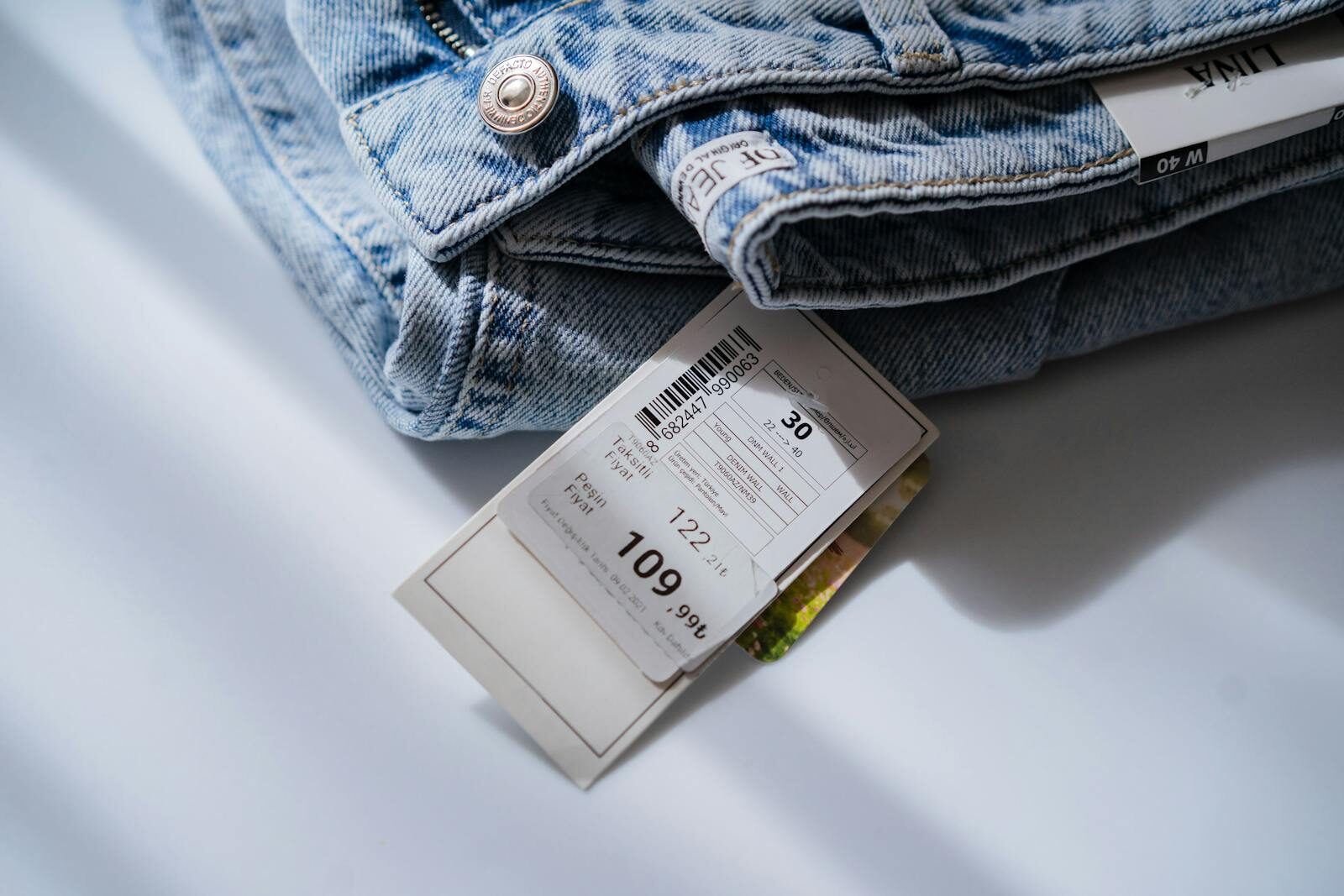
A dress sold at $39 outsells the same dress at $34 — because the “9” itself has been trained into us as a discount signal
Eric Anderson and Duncan Simester ran a series of mail-order experiments through a women’s apparel catalog in 2003. They tested an identical dress at three prices: $34, $39, and $44. The $39 version outsold both the cheaper $34 and the more expensive $44 — a 24% lift over $34, even though it cost five dollars more.
The mechanism is what marketers call charm pricing: the “9” has been weaponized over decades of retail conditioning into a signal that the price has been discounted. We round down (“$39” reads as “$30-something”), we read the 9 as “deal,” and we buy. The lift attenuates when a “Sale!” sign is already present — confirming the 9 is doing the same job the sign would have done.
JC Penney famously tried to eliminate fake-MSRP and 9-ending pricing in 2012, replacing both with honest round-number “everyday low prices.” Sales collapsed within a year. The CEO who tried was fired. The 9 returned.
Adding a deliberately bad third option to a choice makes you pick the option the seller wants — and the math is so consistent that economists had to update their models
The classic demonstration is the Economist subscription experiment that Dan Ariely reproduces in Predictably Irrational. Print-only $59. Print+Web $125. Web-only $125. Almost no one picked web-only at $125 (why would you?). But its presence in the choice set tripled the share of people who picked the Print+Web bundle, because the bundle now looked like a deal next to the obviously dominated web-only.
This is the decoy effect, established by Joel Huber, John Payne, and Christopher Puto in a 1982 JCR paper across six product categories. It violates the regularity axiom of rational-choice theory — adding an irrelevant option shouldn’t change preference share, but it does, reliably, by a lot.
Once you see the pattern, it’s everywhere. Movie-theater popcorn sizes. Tiered SaaS pricing pages with a “value” middle option flanked by an obviously underpowered cheap tier and an obviously overpriced enterprise tier. The middle option is what they wanted to sell you. The other two exist to make the middle look right.
Paying by credit card instead of cash roughly doubles what you’re willing to spend — because the brain literally feels less pain
Drazen Prelec and Duncan Simester ran a sealed-bid auction for Boston Celtics tickets in 2001 with MBA students. Students bidding by credit card bid roughly twice what cash-only bidders did, for identical tickets. The bidders didn’t know they were in a payment-method experiment.
The mechanism is what Prelec named the pain of paying, and fMRI work since has confirmed it. Overpaying activates the anterior insula — the brain’s pain region. Cash spending lights it up. Credit-card spending suppresses it, because the loss feels deferred, abstract, and detached from the consumption.
Apple Pay, tap-to-pay, one-click checkout, and “buy now, pay later” services are all pain-of-paying optimizations. Each removes one more friction between desire and acquisition, and each measurably suppresses the brain signal that would otherwise tell you to stop. The slower the payment process, the less you spend. Retailers have spent twenty years removing those seconds.
Once you can see the architecture, you can’t unsee it. The good news is that most of the effects are smaller on people who know how they work. The bad news is the smell still works on everyone.